2005–2017[]
2005–2011[]
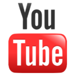
YouTube's first and currently longest-used logo consisted of the site's name in the Alternate Gothic typeface, with the word "Tube" being placed inside a red rounded rectangle, representing a television. This logo is still being used on some pages. YouTube was originally scheduled be launched in March 2001, but was delayed until 2005. In October 2006, Google announced that it had acquired YouTube for $1.65 billion in Google stock, and the deal was finalized on November 13, 2006.
.png "YouTube 2005 (Monochrome).png (3 kB)")
")
2011–2013[]
This modification of the YouTube logo was introduced in July 2011 as a part of the Cosmic Panda experiment, and it officially became the new logo a few months later. It has the red square in a darker color this time. Also, with the introduction of the entirely new layout in 2012, the slogan "Broadcast Yourself" was retired. This logo first appeared on the website as of December 2011 when YouTube launched a new version of the site interface, with the video channels displayed in a central column on the home page, similar to the news feeds of social networking sites.
2013–2015[]
On December 19, 2013, the red rectangle was made lighter in color. Also, the word "You" was made more black and the shadow behind the word "Tube" was removed. During 2015-2017 it was still being used as a secondary logo.
.png "YouTube 2013 (Monochrome).png (3 kB)")
")
2015–2017[]
The gradients were completely removed from the logo in October 2015 to coincide with the refresh of its paid subscription service YouTube Red, formerly known as Music Key. This redesign may have also been made to be in line with Google's new logo and its "Material Design" design language.
2017–present[]
")
On August 29, 2017, YouTube launched its most significant logo update yet, consisting of the wordmark in "almost black" (#282828) and a slightly modified typeface (named "YouTube New") placed to the right of YouTube's priorly redesigned universal icon, the play button, whose color is now pure red (#FF0000). The logo change that is built around the service's play button emblem accompanies a set of new experiments YouTube is set to roll out over the next few months. On August 31, 2017 comment section was updated.
Yoodles[]
- Main article: YouTube Yoodles
Much like Google with their Doodles, YouTube occasionally changes their default logo to a stylized one with relevance to a certain date on various days throughout the year. These special logos are sometimes called "Yoodles".
Icons[]
2005–2011[]
2005–2009[]

2009–2011[]
Still used on some pages.
2011–present[]
2011–2013[]

This favicon was used starting in December 2011 and was replaced in 2013 by the next favicon, but it returned in late 2014 for a brief period of time.
2013–2015[]
2015–2017[]

The gradients were completely removed from the icon in October 2015.
2017–present[]
Following its logo change in 2017, the icon was redesigned and became pure red.
External links[]
| Parent company Staple Services YouTube Android Google Play G Suite Chrome Doodles Convention Hoaxes Other subsidiaries Former Discontinued
|

.png)